Believe it or not every site is sending users a message. It’s not just site that is sending this message but the elements we have built into it. Whether it’s a template site that you bought or had custom built by a professional designer, your site is saying more than just what is written on the page. Your logo is saying a lot. The color, shape and size of your buttons are speaking as well. Of course we can’t forget the fonts and imagery that have been included.
So wouldn’t you want the message to be the same across the various elements speaking on behalf of your brand? I would think and hope so. However, often times this isn’t the case. In navigating the web, whether for personal inspiration or research, I find it confusing when I land on a site that is sending mixed messages.
Some mixed messages I’ve come across over the years have included very strong formal logos trying to be matched with designs that are hand-drawn and quirky. The contrast of these two messages drives me crazy. Are they a company I can trust and will be professional or are they a bunch of goofballs who just want to have fun.
Mixing your messages can lead to miss sells or high bounce rates. But why do these unclear messages exist? They are usually the result of clients’ subjective feelings getting included into the mix of rational thought because a designer didn’t speak up and argue for a well-focused strategy. However the blame can’t always be handed to the clients. I know a lot of designers who love to try new things and think they can just do an awesome design without worrying about how the end result is communicating to users. These are the designers that you sometimes have to give a soft poke at and remind them that we are problem solvers and we are trying to create the next Mona Lisa.
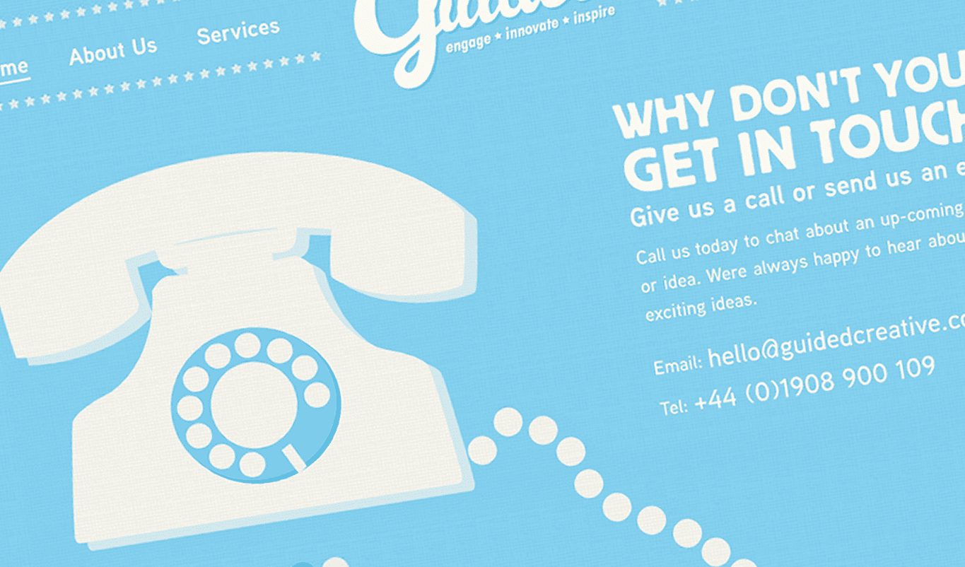
There are a lot of companies who are doing an amazing job of communicating one brand message to their users. Companies like Guided Creative, Invision and Zerply just to name a few. When launching these sites, a user is immediately presented with a single brand message. Although unique from each other, they offer a constant message that allows users to understand what these companies are about.
There is no right or wrong messaging when it comes matching your brand through logo through web design. But the message has to be consistent. In reality, we are taking a step back to the time of building brand identities. Sometimes we get so caught up in the coolest new CSS trick or filter we’ve discovered in Photoshop that we forget that our brands already have a voice. Part of our job as designers is to make that voice strong clear and heard over the crowd.
So the next time we sit down to start designing, let’s look at the voice that is speaking to us through our brand standard elements. Figure out how to make that message standalone among a sea of actions, fonts and textures. Let it raise up and guide the users to have a positive experience.