This following is an excerpt from a book on web design that I’m writing.
Wireframes are an essential tool to help communicate the flow of content. They can be described as a visual guide that represents the skeletal framework of the website. You can think of them as a blueprint for your site. Wireframes connect the underlying structure, known as Information Architecture, to the surface visual design. They help us stay focused on key aspects of our sites such as kinds of information that will be displayed, the range of functions, the relative priorities of the information and functions, the rules for displaying certain kinds of information and finally the effect of different scenarios on the display.

By arranging elements into a particular layout, we can determine the best way to accomplish a particular objective. These objectives have usually been set in the foundation phase of your design. These arrangements depict the page layout including interface elements, modules and navigational systems. We gain an understanding of how these elements work together to create a consistent and understandable content flow.
We can use wireframes in different ways to communicate different aspects of our sites to various team members. For developers, the wireframes will help grasp and comprehend the functionality of the site. Then for designers, wireframes give them reference to push User Interfaces and designs.
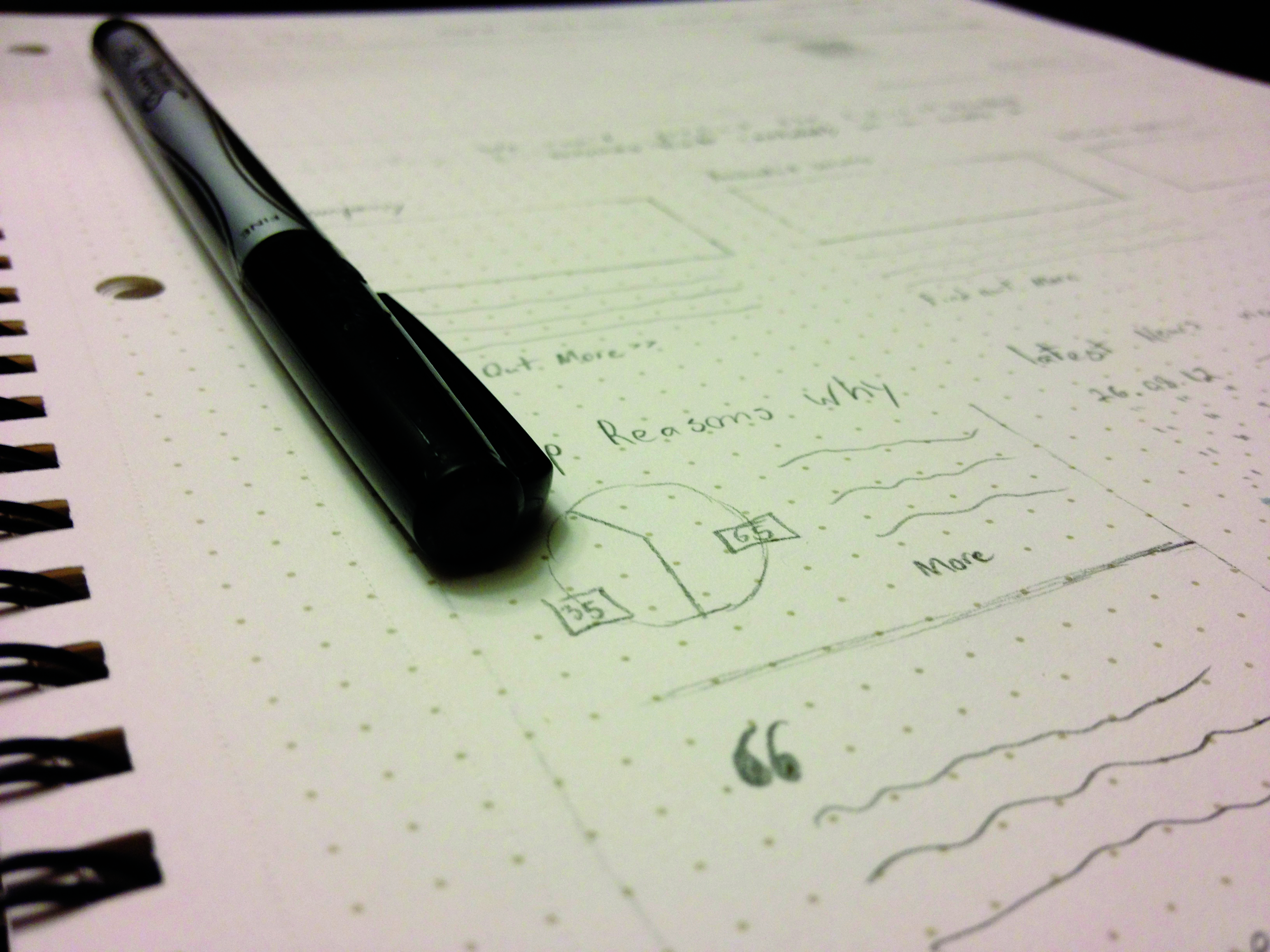
Depending on your level of comfort, there are different levels of fidelity that wireframes can be created at. The two traditional styles are Low-fidelity and High-fidelity. Low-fidelity wireframes are usually very rough sketches (see above). They consist of simple shapes and lines. Content is usually not considered when creating this type of wireframe. These can be great for getting ideas out of your head onto paper. It allows you to quickly decide whether the arrangement of elements will work to communicate your objectives. These should be created very quickly.

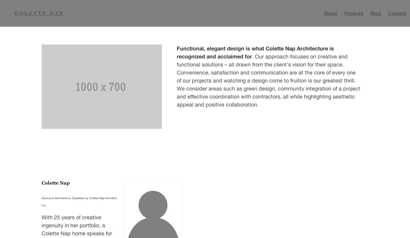
Once you find a low-fidelity wireframe that works, it’s time to refine your drawings. These are your high-fidelity wireframes. Again there are several techniques you can use to create these. If you have illustrative skills, then these wireframes can be drawings using more defined shapes and content samples. However, most of us aren’t the greatest illustrators so there are desktop and online tools that are both cost effective and easy-to-use. Two of the best options that I’ve come across are UXPin and Balsamiq. Both contain a collection of component libraries that you can drag and drop onto a canvas. You can also use tools like Adobe Illustrator. If you use Illustrator you can create the elements yourself or download sets from talented designers.
One of the greatest benefits of using an online tool like UXPin is that it can show you how your arrangement will work on various screens as well can be used as a simple Prototype. Resources like UXPin are growing in popularity as they help to better communicate how the arrangement of elements will work together.

If you have a comfort level with HTML/CSS then you can use a framework like Wirefy. But again these depend on your comfort level. The benefit of using a service like InVision or UXPin is that you can display your block wireframes, Illustrator or Photoshop mockups with clickable elements by creating hotspots and linking screens together. The benefit of using a framework like Wirefy is that you can then turn that wireframe into your foundation for the rest of your design to sit on.
There is no right way or wrong way to wireframe. It all depends on the way you think and your comfort level with your site strategies. I do recommend that you always start with a simple sketch to get some of your ideas out of your head. This will help get you into the right mindset and allow you to immediately test and iterate on. Having the ability to test early and quickly is one of the most important pieces of creating a successful strategy.

