Yesterday, Apple released its latest redesign of their iOS. Immediately the world of Twitter exploded with comments either for or more loudly against this new design. But are their comments and anger justified. It really comes down to few things. Most of these comments are blind. They are making conclusions about icons, fonts and other aesthetics without knowing the decisions that went into the making of those designs. I’m going to throw this out there and say I actually quite like the approach that Apple is taking. It’s not because I’m an Apple fanboy, but because I’m looking past the visual layer into how the actual experience is going to be.
iOS isn’t the only one making moves to create a better mobile experience for users. Windows Metro did this and Google continues to perform minor changes in that general direction. We have classified this as flat design, but in reality what we’ve done is helped users perform tasks and disgust content easier. I think this is a maturing of mobile design. We are putting the focus back on the users and what they want to accomplish when using a particular app.
Beyond creating a more functional enlightening experience, we can also create a visual experience. We are moving away from the world of tap-based apps and starting to create a world full of immersive apps. These apps have been built and designed with creating a fully integrated experience in mind. We’ve seen this in apps like Summly and Yahoo Weather. These apps don’t feel like work to interact with. They’ve are actually quite immersive and intuitive to use. You don’t need to lead the user in a series of tours and tutorials before they get to the app. These apps just work.
If you look closer at the designs that Apple has released you’ll notice that some of the new or restyled apps do just that. They make it so you don’t have to fumble around with clicking on buttons that are too small for your fat fingers. Instead you get to swipe or long press anywhere to perform a simple task. By offering these techniques you’re breaking down a barrier that some have struggled with on the current iOS platform.

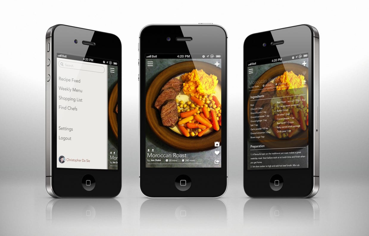
In fact, working on my startup, Forgetful Chef, we looked at how we too could make our app as intuitive and transparently easy to use. Home Chefs don’t have a lot of time so we want them to be able to perform an action while using our app as quickly and simply as possible. But if they do get more time to sit and relax with our app then they will see we’ve still paid attention to the small details that can add an extra layer of delight without having to provide tutorials on how to use it.
The way you experience an app should never be limited by the size of our fingers. Our job as designers and developers is to create a way for people to easily access or share information. I would venture to say over the next several months we will see a huge shift in app design and development into creating more immersive environments. Since we check our devices over 100 times a day shouldn’t we be creating an experience that engaging and intuitive. The mobile OS world is quite robust and we’ve only been scrapping the surface of what can be accomplished on these platforms. It’s time to take our apps to the next level.
I think the conversation between skeuomorphism and flat design will continue as long as we continue to only look at the visual output of designs. Once we start looking past these generic terms and focus our efforts on creating a delightful experience for users to access our app information then we will start to take the conversation to a deeper level. We won’t have to belittle a design because a button is 3 pixels too round or whether a border is too thick because we will be able to determine whether an element is simply enhancing the content that its containing. Until then we aren’t really talking about what is best for the user. We are just trying to feed our own egos about a style of design we like or don’t like.
Focus your efforts on getting information into the users hands and it won’t matter whether it’s skeuomorphism or a flat design. It will just be design.

