Recently, I got thinking about how differently creative designers approach their client’s problems. Some work best by just throwing themselves in the adobe suite and start working through design after design until they feel they’ve gotten it right. Others use different methods or technologies to pull together a useful solution.
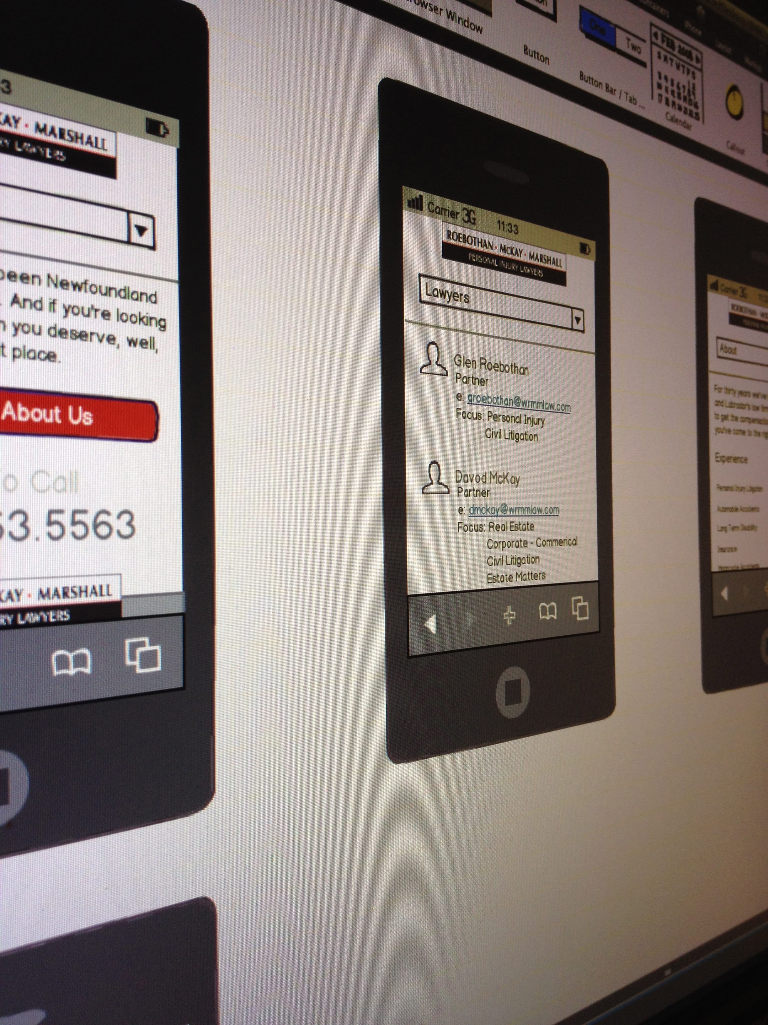
For me, I always start with a sketch. It allows my basic thoughts and knowledge about the direction I think the project should take to get out on paper. From here I usually take my rough sketch and begin working in either Photoshop or Fireworks. These days, I spend my time mostly in Fireworks. I start by building a general digital version of my sketch. As I’m working through this I begin to revise the experience and wireframe to a more finalized version. I find this useful because it helps me really see how the information is going to look with colours, typefaces and general layout. I get a much better understanding of how the user may use the end product. After I’m happy with what I see in front of me on screen, it’s time to go back to the sketchpad and build out further wireframes that are more refined. I usually go through several personal revisions during this process as ask myself several questions regarding the experience that the client would like to provide the users with. In my wireframes, I never add colours even though I have them semi determined with my single onscreen design.
Once I’ve gotten my wireframes to a place that tells a cohesive story, I release these to close some trusted ‘advisors’ who are not afraid to tell me I’m completely out to lunch. These are some of my biggest critics. If they approve then it’s time to send the wireframes off to the client. On several occasions, this has lead to a very quick turnaround with minimal changes or additions.
From here it’s back to my design. I tend to revisit the design I initially did based off my rough wireframe. Sometimes this has lead to me completely changing the design look and feel. But often, I still pretty good about fonts choices, imagery, colour combinations and whatnot. I continue to revisit this until I feel a tingle of excitement rise up from within. Yes I’m one of those designers that like to feel excited by my own work. I’ve found that if I feel the tingle from within, I’m usually on the right track for my client too. Once the tingle is strong across all the pages, I send off to client. Like I said before this usually pays off because the client enjoys what they see. Sometimes they’ll ask a few questions have and have a few tweaks but nothing major. Then it’s off to coding.
I’m a test, test and test type of guy. Once it works fairly well at the base level, it’s off to client again. This is where they tend to realize they’ve forgotten several widgets and information. This is why I never like to go too far with this process at first. Once I’ve gotten that all settled, it’s on to the hardcore coding phrase. I usually won’t show client anything else unless requested to do so until I’m done and have checked all the files cross-browser. Finally, I get the final approvals and then on to launch.
This is my process for a creative project. This is what works for me, but it doesn’t mean it works for everyone. What is your process?


